Sabrina Lavezzi

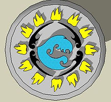
So for this post-midterm 3D modeling project we were told to pick an object that we would then make a 3D rendering of, but with a twist to said object. Surprise surprise, I chose to render a frisbee or in the ultimate world a disc. So my twist I'm doing on this is making the top of the disc have elements that extrude from it. The idea for this is to have a disc designed that would specifically be made for the use of a wall disc. All ultimate players that I know have wall discs. What that means is that whatever discs we buy that we either A. really like, B. are a keepsake, or C. don't want to play with, we hand them up on our wall. My disc would be sold to be specifically one of these discs. For my disc I'm using a design I used in printmaking for my team, and the elements on the disc are coming out of the top. This design is for Truman ultimate in general because it combines elements of both the girl's team logo and the guy's team logo.

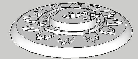


Now I am primarily working on the color scheme of the disc. I need to make the disc look aesthetically pleasing so that in reality if I were to actually make this, ultimate players would want to buy it and hang it on their wall. I'm having a hard time trying to figure out which colors cool best and how I should arrange the colors on my disc. I'm not overly or even slightly pleased with any of them so I still have a far way to go until I render something that will actually be good enough to turn in.
Next what we need to do for this project is add color and texture to our object so that it looks more realistic. For me I thought this would be easy, it cannot be that hard to get a color scheme that looks good on the face of a disc. Boy was I wrong, when I first laid out everything I just made the colors the same as that which would be seen on the logo's themselves. Though, the girls logo colors do not mix that well with the guys colors, maybe that's the true reason for the teams not getting along, but in reality we do so I think I can get these colors to work. I've been working on changing the colors little by little and I think their getting better, but I'm still not satisfied yet.


Our next challenge after creating our object was to make a 3D animated orbit of it. This posed just as hard for me this time as it did last time, but for different reasons. Making the animations themselves was not all to difficult, I came up with my orbit fairly quickly. What made me take about a week and a half was trying to figure out how to render the damn thing. Every time I tried to render it, no matter what I did, it would only be the wire frame of my object doing the orbit. Even when I just tried to render out each frame by photo's it was still the wire frame. I messed around with this for about a whole week before I gave up and just resorted to screen recording my animation from SketchUp. Which in the end worked and I was finally able to move to the next step in the process, which was to make a presentation.
The next step in the multi-step project was to make a presentation for our 3D object. At first I thought, simple, a presentation can't be that hard, and what do you know it really wasn't. I think it was mainly because I know exactly the purpose that my object would serve and the audience that I was reaching out to. I am trying to reach out to fellow ultimate players because I know they're some of the only people who hang as many discs on their walls that they can fit. So basically I gave this presentation as if I were trying to sell my project to myself. Which meant I didn't have to do much abstract thinking. I made this presentation using Prezi, which was ok. I never used Prezi before so I think once I put a little more time into learning it I'll enjoy it more, but for now I found it a little boring.
Here's a link to my presentation:
http://prezi.com/-weacvey9zgc/?utm_campaign=share&utm_medium=copy
or click on the picture to the right and it will also bring you to the presentation.

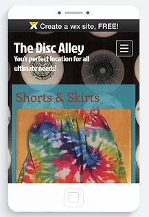
Then, yet another part of this project was to create a website for our object. This was actually fun for me because the idea, like the presentation, was already there. I knew who my audience was so I knew who to gear my website towards. The ultimate world has quite a few company's that we go to inorder to find gear, discs, and thother such merch/swag, just to name a few we have; Five (www.fiveultimate.com), Disc Store (https://www.discstore.com), VC (http://ca.vcultimate.com/). For my site I made it geared towards ultimate players. This site won't only sell discs, but also jersey's, shorts/skirts, hats, friction gloves, and other merch. Though our pride and most unique asset is our 3D wall discs that we can individually craft for each customer.
Click on the image to bring you to the website. We also needed to make the website for a phone, in wix this is pretty easy to do so it wasn't that difficult in any shape or form. to see this in the phone format please look it up on your device.

Then the last part to the whole project was to make a 8x10 4 color ad for a magazine. This was a nice addition to this group of assignments, because it sent us back home to what we are comfortable doing. I know how to make ads, and it is not something that causes me stress. For my ad I use the tagline "Not Just Another Disc," that way people, Ultimate fans, are drawn to the idea of something different out of something as familiar to us as a disc. I thought that doing this ad would be hella easy and I would wip it out in like an hour and it would look great, though what I made for class on friday was HORRIBLE I'm just annoyed I made something this horrible! I'm hopping that I will get some better inspiration from classmates and whatnot before I have to turn it in for got because It needs so much work!


Ok so I fixed it! This looks like 100% better than my original! I used the background I used for my website, which I think was actually kind of smart because it ties the two together. I used all the same elements in this ad, I just made smarter decisions to how I used them so that it looked more aesthetically pleasing. I changed Drizzy's cutout to just be a silhouette and also made the positioning of my 3D rendered disc better. In the end I actually really enjoy how this ad turned out and a bit surprised with it as well!
